Sometimes API changes make my day, namely when they enable me to refactor a historically gnarly bit of code to a cleaner, more efficient, and shorter version of itself. Alas, library maintainers do not always agree with me in terms of what needs to be changed. Sometimes they decide to make my life a little bit harder. The particularly nasty thing is that I can’t always object to their changes, because they might make perfect sense in other contexts, they just break my one weird use case. Today is such a day, so I shall tell you a story of sorrow and woe.
The use case
One of my clients does a lot of monitoring, which is a good thing. I’m excited about monitoring and love implementing fancy dashboards, awesome data wrangling toolchains, and blazing fast collectors. All of those things are in place there and I am actually pretty proud of the work that the people who work there and I have done.
This particular client is a little special; they wanted a lightweight statistics portal that serves prerendered plots for the operations staff to look at without having to have great bandwidth or a browser with JavaScript enabled. There are a few good tools out there that create images from timeseries data—a particularly popular example is RRDTool—, each with a unique set of shortcomings. As this client used mostly Python for their API and data analysis, I decided to go for a tool that makes programming in LaTeX seem like the holy grail of user experience: matplotlib.
Despite its sometimes clunky and awkward API, it’s a battle-tested functionality monster. I was convinced it was up for the task from the get-go, and while I spent a few hours looking at obscure functions hidden deep within the many layers of matplotlib, I ultimately got the job done. To make the page render a little faster and reduce the load on the API service, I actually made Celery workers do the heavy lifting. This lets the served page call to an API endpoint that then takes a job ID and returns a redirect to the prepared image once the workers are done. This is an overly complex way of generating images on-the-fly, but it works quite well and has its very own hacky charm. Once I figured out how to generalize the job dispatch and image creation mechanisms, it also made adding functionality quite simple.
So far, so good. And then matplotlib decided to release version
2.0.0.
##Breaking staging
Because always upgrading to the bleeding edge is a good
idea—statements like this might be why people are hesitant to take
advice from me—we decided to update to the newest version of matplotlib.
In our defense, it had been out for a month and a half before we
upgraded. For some reasons someone decided it was a good idea to test it
in the staging environment instead of locally, and, thus, graph
generation failed. Hard. None of the graphs worked any more. Because I
was the one who concocted the matplotlib code, I was also assigned the
task to fix that. So, naturally, the first thing was to break my local
build and start looking at stack traces. I soon realized that the
failure had resulted from us using a semi-internal matplotlib function,
namely get_facecolor. Let me explain why we needed to use
this function, how it has changed, and how I went about fixing it.
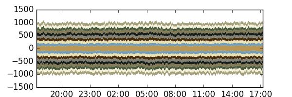
Our statistics were displayed as stackplots with a custom colorscheme. Two of the values of each plot were related, so they were supposed to have the same color. One was always displayed as negative, one as positive. For the sake of this post, let’s assume that we model people entering and leaving elevators over a period of time. Let’s also assume that entering should be displayed as positive and leaving as negative. We could generate the plot for this like so:
from matplotlib import dates
from matplotlib import pyplot as plot

COLORS = ["#BB9756", "#749EB5", "#ECE1B3", "#462C0A", "#848275",
          "#181F1A", "#837954", "#495A3E", "#F5F2D9", "#A29F7A"]


def prep_axis(ax):
    ax.set_prop_cycle('color', COLORS)
    ax.xaxis.set_major_formatter(dates.DateFormatter("%H:%M"))


def render(filename, stats):
    fig = plot.figure(figsize=(6, 2))
    ax = fig.add_subplot(111)
    prep_axis(ax)

    ax = plot.stackplot(stats["time"], *stats["entering"],
                        edgecolor="none")
    # this is where we need you, facecolor!
    colors = [x.get_facecolor() for x in ax]
    plot.stackplot(stats["time"], *stats["leaving"],
                   edgecolor="none", colors=colors)

    fig.savefig(filename)
This would leave us with a very simple plot, much simpler than the one you would like to look at in production, where you would like to at least have a legend, pretty the stats up a little and generally make this a bit less brittle.
[80, 120[ for entering and leaving).
I know this example is a little contrived, but bear with me. Suppose
we use this service for a while before it breaks, like our real-world
application did. The stack traces tell you there is something wrong with
the format returned by get_facecolor—they tell you they
expected a string, but you gave it a numpy.ndarray. It
tries to call the find method, which is defined for
strings, and fails. You never looked at the color format returned by
get_facecolor, so you decide to take a peek. In your
youthful ignorance you expect to find something along the lines of the
input colors, a CSS-style hexadecimal RGB value. Instead, you find this
abomination:
array([[0.73333333, 0.59215686, 0.3372549, 1.]]). What is
that? It is a nested numpy array,
containing what seems to be an RGBA value, encoded as floating point
numbers from 0 to 1. What the heck is this
format.
I can’t describe the disgust I felt when I saw this. I’m sure there
is a good reason for formatting the color like that, but as a somewhat
novice user of the library I don’t want to see this. This is just
terrible. And it seems like as of matplotlib version 2.0.0,
other parts of matplotlib agree with me. So the format doesn’t even play
nicely internally, which erodes my argument that there might be a good
reason for formatting the color like that.
So, how can I fix that without diving into the documentation of matplotlib again and trying to figure out what to do, because that’s obviously better than actually understanding what’s going on—again, don’t listen to me, please? Reverse engineering the format to get it back into the CSS-like form is a guaranteed solution, because the CSS-like form itself still seems to work. Let’s do that.
def list_to_hex(l):
    return "#{:02X}{:02X}{:02X}".format(*[int(e*255) for e in l])

[...]

def render(filename, stats):
  [...]
  colors = [list_to_hex(x.get_facecolor()[0]) for x in ax]
  [...]
Holy unmaintainability, Batman! In all seriousness, though, let’s walk through the steps and the resulting code to make this mess a bit more digestible.
- We get the color with
get_facecolor:x.get_facecolor() - We take the first element of that array, because that’s the actual
list we care about:
x.get_facecolor[0] - We magically transform silly RGBA into CSS hex:
list_to_hex(x.get_facecolor[0])
All of the actual transformation magic then happens in
list_to_hex. Let’s walk through that as well:
- We multiply every element in the array with 255 to get a value that
fits in a byte:
[e*255 for e in l] - We cast it to an integer to actually make this a byte (will work
approximately):
[int(e*255) for e in l] - We pass unpack that list into a format string (we can also use
str.jointo avoid repetition if we first remove alpha):"#{}{}{}".format(*[int(e*255) for e in l]) - We tell the format string to format it as a two character
hexadecimal value:
"#{:02X}{:02X}{:02X}".format(*[int(e*255) for e in l])
We’re done. Phew.
Let’s inline the helper function as well, just for the heck of it, so we can see a before-after comparison:
# before
[x.get_facecolor() for x in ax]
# after
["#{:02X}{:02X}{:02X}".format(*[int(e*255) for e
                                       in x.get_facecolor()[0]])
  for x in ax]
Now is probably an appropriate time to tell you that chances are you
won’t need this. Even if you have a similar use case to my client and
you need to match color, if the two arrays are in the same order (as
they will always be in the above case), you can reuse
COLORS and be done with it. This also saves you a line of
code, because you needn’t build a colors list.
def render(filename, stats):
    [...]
    plot.stackplot(stats["time"], *stats["leaving"],
                   edgecolor="none", colors=COLORS)
    [...]
Sadly, in the case of my client, it wasn’t this simple and our fix looked a little more gruesome. It is documented pretty well, so I hope that even in the unlikely event that I die before being able to hand over the project, whoever looks at it will, after a moment of rage and posing the furious question of why I found no better way to do this, just shrug and read on.
The takeaway
You could take away a lot of different things from this, for instance that I should try and understand the frameworks that I use a little better or that matplotlib sucks. I think both are valid sentiments, but I happen to disagree with them. What I decided to take away is that formats, even if they’re internal and supposedly local to one component, need to be congruent. If you decide to format colors as nested numpy arrays of floating point numbers internally, please make sure that the rest of your API working with colors works with that as input, even if you don’t think anyone outside of your component will ever see that data. That’s a weak conclusion, I suppose, but not adhering to it broke a real system, so it can’t be completely worthless.
See you soon!